FlowDx's attention heatmaps are generated based on the DeepGaze IIE model. This model was proposed by Linardos et al. in the ICLR 2021 paper "DeepGaze IIE: Calibrated prediction in and out-of-domain for state-of-the-art saliency modeling," originating from the Bethge Lab for Computational Neuroscience at the University of Tübingen, Germany. On the MIT/Tilburg Saliency Benchmark, DeepGaze IIE ranks first across multiple metrics, with its predictions showing a correlation of over 0.87 with real human eye-tracking data.
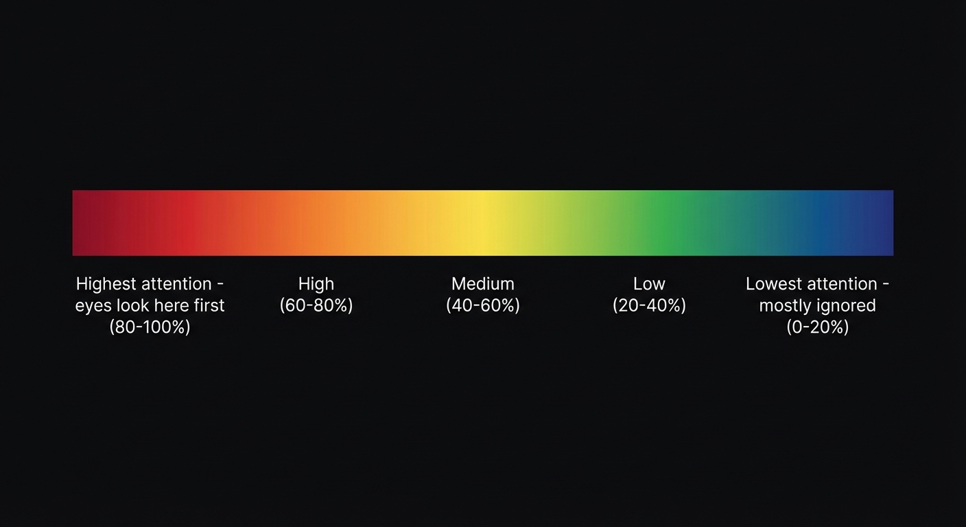
What do the colors in the heatmap represent?
| Color | Meaning | Attention Percentage |
|---|---|---|
| Red | Highest attention area — users see this first | Top 10% |
| Orange-Yellow | High attention — gaze moves here quickly | 10-30% |
| Green | Medium attention — noticed during browsing | 30-60% |
| Blue | Low attention — ignored by most users | 60-90% |
| Dark/Colorless | Attention blind spot — almost no one sees this | Bottom 10% |
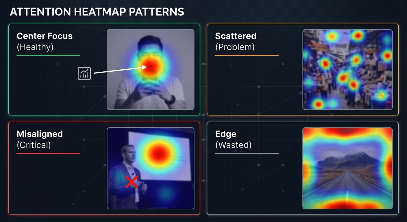
Common Heatmap Patterns
Pattern 1: Centered (Healthy)
Red areas are concentrated on the core information of the content (faces, headlines, CTA buttons). This indicates a clear visual hierarchy, allowing users to quickly understand the message you want to convey.
Pattern 2: Scattered (Problematic)
Red areas are scattered across multiple locations with no clear primary focus. This suggests there are too many elements in the frame, causing attention to be fragmented. Solution: Reduce the number of elements and establish a clear visual subject.
Pattern 3: Misaligned (Serious Problem)
Red areas are concentrated where you don't want users to look (e.g., an irrelevant element in the background), while your core information (headline, product) sits in blue or green areas. This is a CTR killer.
Pattern 4: Edge (Waste)
Attention is concentrated on the edges of the image. This usually happens when the subject is too small or there is too much white space. The brain is naturally drawn to high-contrast areas at the edges (such as the boundary between the image border and the background).
Visual Path: The User's "Reading Route"
In addition to heatmaps, FlowDx generates a Visual Path—predicting where the user's eyes start and in what order they scan the frame. An ideal visual path should:
- Start from the strongest attention anchor (usually a face or the largest text)
- Move to secondary information (subtitles, product images)
- Finally land on the CTA (Call to Action)
If the path skips key information or wanders in irrelevant areas, it indicates a problem with visual guidance.
Five-Dimensional Cognitive Score Explained
FlowDx doesn't just give you a total score; it evaluates your content across five cognitive dimensions:
- Attention — Whether the content can grab the eye within 0.3 seconds
- Visual Focus — Whether there is a clear visual hierarchy and guiding path
- Emotional Impact — Whether it can trigger an emotional response (curiosity, excitement, resonance)
- Action Drive — Whether there is a clear Call to Action (CTA)
- Memory Strength — Whether users can remember your content after viewing
Each dimension is scored from 0-100. 70+ is excellent, 50-70 needs optimization, and below 50 indicates serious issues.
Start Using Heatmap Diagnosis
How to Optimize Content Based on the Diagnosis Report
After receiving your FlowDx diagnosis report, address issues in the following order of priority:
Priority 1: Fix "Misaligned" Issues (Red Diagnosis Items)
If attention is concentrated in the wrong place (background elements, irrelevant details), this is the most serious issue. The solution is usually to reduce the visual weight of distracting elements (blurring, lowering saturation) while enhancing the prominence of core information (enlarging, adding contrast, adding borders).
Priority 2: Establish a Clear Visual Path (Orange Diagnosis Items)
If the heatmap shows scattered attention, you need to establish a clear visual hierarchy. Use size contrast (the most important element should be the largest), color contrast (use high-saturation colors for core info), and spatial guidance (arrows, lines, or the direction of a person's gaze) to lead the user's eyes along your intended path.
Priority 3: Improve Overall Cognitive Scores (Yellow Suggestion Items)
Dimensions in the five-dimensional score that fall below 60 need focus. Common improvement methods include:
| Low Dimension | Possible Cause | Direction for Improvement |
|---|---|---|
| Attention < 60 | Visuals are too flat, lacking prominence | Increase contrast, add faces, use high-saturation colors |
| Visual Focus < 60 | Too many cluttered elements | Reduce element count, establish primary and secondary hierarchy |
| Emotional Impact < 60 | Content lacks emotional triggers | Use emotional expressions, create contrast, tell a story |
| Action Drive < 60 | Lacks CTA or action cues | Add arrows, buttons, or trigger words like "Now" or "Limited Time" |
| Memory Strength < 60 | Content is too generic, lacking uniqueness | Establish brand symbols, use unique color schemes, create visual memory points |
Limitations of Heatmap Analysis
Attention heatmaps are powerful tools, but they have limitations. Understanding these boundaries helps in using them more effectively:
- Predicts the "Average User" — Heatmaps reflect the average gaze distribution of a group; an individual user's path may vary.
- Does Not Directly Equal Click-Through Rate (CTR) — High attention doesn't always translate to high clicks. A user might notice something but choose not to click (e.g., if the content doesn't look interesting enough).
- Depends on Image Quality — Low-resolution or heavily compressed images may affect prediction accuracy.
- Cultural Differences — Users from different cultural backgrounds may allocate attention differently to colors, faces, and symbols.
FlowDx's five-dimensional cognitive score is designed to compensate for the shortcomings of pure heatmap analysis by integrating attention, emotion, memory, and other dimensions for a more comprehensive content diagnosis.
Frequently Asked Questions (FAQ)
Is the red area on the heatmap always the best?
Not necessarily. Red indicates the area users look at first, but the key is whether the red area falls on the information you most want to convey. If the red is on an irrelevant background, it indicates a problem. The ideal state is: red covering core information (product, face, headline) and blue covering secondary areas.
How many fixation points are ideal for a visual path?
For thumbnails and covers, 3-5 fixation points is the optimal range. Too few (1-2) suggests the content lacks information; too many (6+) suggests attention is too scattered. Ideal path: Primary Focus → Secondary Info → CTA, forming a clear narrative line.
Why is my heatmap different from someone else's analysis of the same image?
FlowDx uses a deterministic model (DeepGaze IIE), so analysis results for the exact same image are perfectly consistent. If you see different results, it may be due to differences in image resolution, cropping, or file compression. It is recommended to use original resolution images for analysis.
What is the difference between video heatmaps and static image heatmaps?
In video content, attention distribution changes over time. FlowDx performs frame-by-frame analysis on videos, with each frame having its own heatmap. Video adds another dimension—dynamic elements (moving objects, scene cuts) strongly attract attention. The key to video analysis is finding the frames where attention is weakest, as those are the moments users are most likely to scroll past.
Start Using Heatmap Diagnosis
Upload your content to FlowDx to get attention heatmaps, visual paths, and five-dimensional scores. See exactly what happens in the user's brain when they see your content.
References
- Linardos, A. et al. (2021). DeepGaze IIE: Calibrated prediction in and out-of-domain for state-of-the-art saliency modeling. ICLR 2021.
- Borji, A., & Itti, L. (2013). State-of-the-art in visual attention modeling. IEEE Transactions on Pattern Analysis and Machine Intelligence, 35(1), 185-207.
- Bylinskii, Z. et al. (2019). What do different evaluation metrics tell us about saliency models? IEEE TPAMI, 41(3), 740-757.