The e-commerce product main image is the first gate of the conversion funnel. Users scan 5-8 product images per second on search results pages. Your main image needs to convey two pieces of information within 200 milliseconds: what this is, and why they should click.
Key Differences Between E-commerce Main Images and Social Media Covers
The psychological state of e-commerce users is completely different from those browsing social media:
- Clear search intent — They already know what they want; you just need to prove yours is better.
- Strong comparative mindset — Your image is displayed side-by-side with competitors; differentiation is your only weapon.
- High price sensitivity — Visual quality directly affects the user's acceptance of the price.
6 Cognitive Principles for High-Converting Main Images
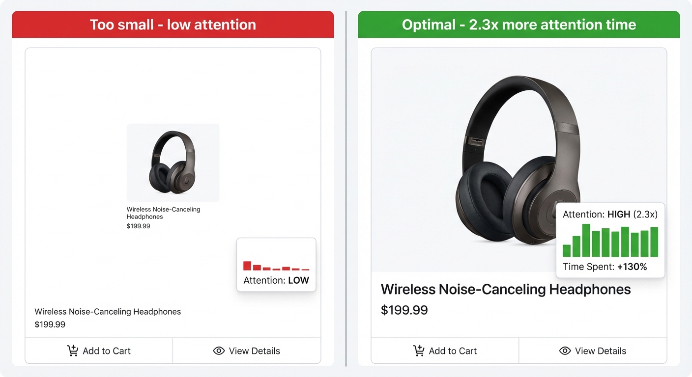
1. The Product as the Protagonist: Occupying 60%+ of the Frame
Unlike social media, the protagonist of an e-commerce main image is the product itself. Attention heatmap data shows that when the product occupies more than 60% of the frame, the user's gaze time increases by 2.3x, and the click-through rate (CTR) increases by approximately 35%.
2. White/Light Backgrounds are Still King
While it sounds cliché, the data doesn't lie: on Taobao search results pages, main images with clean backgrounds have a 28% higher CTR than those with busy backgrounds. The reason: the simpler the background, the easier it is for the brain to focus attention on the product.
3. Texture Conveyance > Feature Listing
Research by Lacey & Sathian in Cerebral Cortex (2011) proved that the brain's somatosensory cortex automatically simulates touch just by looking at an image ("visual-tactile cross-modal activation"). A product image that makes people "feel" the material is more persuasive than text listing 10 selling points. Light, shadow, texture, and angle are key.
4. Use Size Contrast to Establish Reference
Users cannot judge the true size of a product from an image alone. Placing a reference object (a hand, a common item) can immediately establish size perception, reducing cognitive uncertainty and increasing purchasing confidence.
5. Contextual Scenes > Pure Product Shots
Rizzolatti & Craighero's classic review in Annual Review of Neuroscience (2004) describes the mirror neuron system: placing a product in a usage scenario can activate the brain's mirror neurons, allowing users to automatically imagine themselves using it. Elder & Krishna in Journal of Consumer Research (2012) further confirmed that images showing a product held with the right hand increase purchase intent (as most people are right-handed). Note, however: the scene must not overshadow the product; the product must remain the visual focus.
6. Trust Badges: Reducing Decision Friction
Trust signals like "100,000+ sold monthly" or "99% positive reviews" should appear on the main image, but they should be small and refined. Robert Cialdini, in Influence (1984), lists Social Proof as one of the six principles of persuasion. An fMRI study by Klucharev et al. in Neuron (2009) found that social proof can reduce risk assessment activity in the prefrontal cortex, thereby speeding up decision-making.
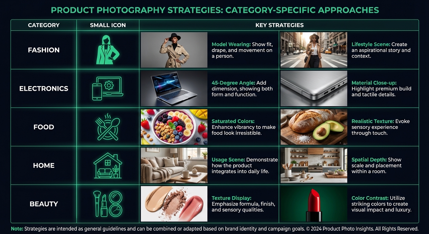
Main Image Strategy Differences by Category
| Category | Core Strategy | Attention Anchor |
|---|---|---|
| Apparel | Model on-body + Scene | Wearing effect |
| 3C Digital | 45-degree angle + Texture close-up | Craftsmanship/Texture |
| Food | Saturated colors + Realism | Appetite arousal |
| Home | Usage scene + Sense of space | Lifestyle association |
| Beauty | Texture display + Color contrast | Usage results |
Diagnose Your Main Image with FlowDx
Main Image A/B Testing: Validating Your Optimization with Data
Optimizing main images shouldn't rely on gut feeling; it needs data validation. Here are best practices for e-commerce main image testing:
Taobao/Tmall
Use the "Creative Effect Analysis" feature in Business Advisor (Sycm) to see CTR differences between different main images. It is recommended to change only one variable at a time (background color, product angle, text content) to know exactly what factor drove the improvement. Usually, 1,000+ impressions are needed to achieve statistical significance.
Pinduoduo
In Pinduoduo's recommendation traffic distribution, the weight of the main image is particularly high. You can test the CTR of different main images through multiple plans. Note that Pinduoduo users are more price-sensitive; hinting at "value for money" (price comparisons, discount labels) in the main image usually performs better than pure aesthetics.
JD.com
JD users are more sensitive to the sense of quality. The main image needs to convey a feeling of "authentic," "high-end," and "professional." A white background + 45-degree angle product shot + brand logo is the basic paradigm for JD main images. Differentiation should be achieved through lighting texture and detailed close-ups.
Advanced Techniques: Using Cognitive Biases to Boost Conversion
The following cognitive biases can reasonably enhance the appeal of product images without "deceiving" the user:
- Anchoring Effect — Displaying a comparison between the original price and the current price in the main image causes the brain to automatically anchor to the original price, making the current price feel cheaper. Tversky & Kahneman's classic experiment in Science (1974) confirmed this effect.
- Scarcity Effect — Signals like "Limited Edition" or "Only XX pieces left" activate the amygdala's urgency response. Cialdini (1984) listed scarcity as one of the six principles of persuasion.
- Visual Completion — Showing a part of the product rather than the whole activates the brain's curiosity (the "Closure Principle" in Gestalt psychology), driving users to click to see the full image.
- Peak-End Rule — A theory proposed by Daniel Kahneman: users remember the most intense moment and the final moment of an experience. The product image needs a "peak" visual impact point.
E-commerce Main Image Checklist
Go through this before publishing:
- Does the product occupy more than 60% of the frame?
- Are product details visible at the actual size in search results?
- Is the background clean and not distracting?
- Is there at least one trust signal (sales/rating/brand label)?
- Is the product's texture reflected through light and shadow?
- Does it stand out enough when placed next to competitors' images in search results?
Frequently Asked Questions (FAQ)
Which has a higher CTR: white background or lifestyle scenes?
It depends on the category and platform. In Taobao search results, white background images have a higher average CTR (because search users have clear purchase intent and want to see the product quickly). However, in recommendation feeds like "Guess You Like It," lifestyle scenes often perform better (because recommendation users are in a "browsing" mindset and need their interest sparked). Suggestion: Use a white background for the main image and a lifestyle scene for the first screen of the detail page.
Does text on the main image affect search ranking?
Taobao's AI system uses OCR to recognize text on main images. If the text contains search keywords, it theoretically helps with matching. However, cluttered, spammy text overlays will be penalized by the platform. Taobao rules explicitly state that marketing text on the main image cannot exceed 20% of the image area. It is recommended to only put the brand name and the most critical selling point (e.g., "Lightest on the Market") on the main image, leaving detailed information for the detail page.
Should the same product use different main images on different platforms?
Yes, absolutely. User psychology, interface design, and the competitive environment vary across platforms. Taobao users are sensitive to promotions, JD users value quality, Pinduoduo users care about value for money, and Xiaohongshu users pursue aesthetics. Using one image for everything is a common mistake—using FlowDx to separately diagnose main image performance for each platform is the most efficient approach.
Is the loading speed of the main image important?
Extremely important. The average patience of a mobile user is only 3 seconds. If the image file is too large and loads slowly, users will swipe away before they even see your product. Suggestion: Keep main image files under 200KB, use JPG format (better compression than PNG), and a resolution of 800×800 is sufficient for Taobao/JD display requirements.
Diagnose Your Main Image with FlowDx
Upload your e-commerce main image to FlowDx, select the "E-commerce" platform, and get attention analysis and conversion suggestions optimized for e-commerce scenarios.
References
- Lacey, S., & Sathian, K. (2011). Multisensory object representation: Insights from studies of vision and touch. Cerebral Cortex, 21(9), 2047-2057.
- Rizzolatti, G., & Craighero, L. (2004). The mirror-neuron system. Annual Review of Neuroscience, 27, 169-192.
- Elder, R. S., & Krishna, A. (2012). The "Visual Depiction Effect" in advertising. Journal of Consumer Research, 38(6), 988-1003.
- Cialdini, R. B. (1984). Influence: The Psychology of Persuasion. Harper Business.
- Klucharev, V. et al. (2009). Reinforcement learning signal predicts social conformity. Neuron, 61(1), 140-151.
- Tversky, A., & Kahneman, D. (1974). Judgment under uncertainty: Heuristics and biases. Science, 185(4157), 1124-1131.
- Kahneman, D. (2011). Thinking, Fast and Slow. Farrar, Straus and Giroux.