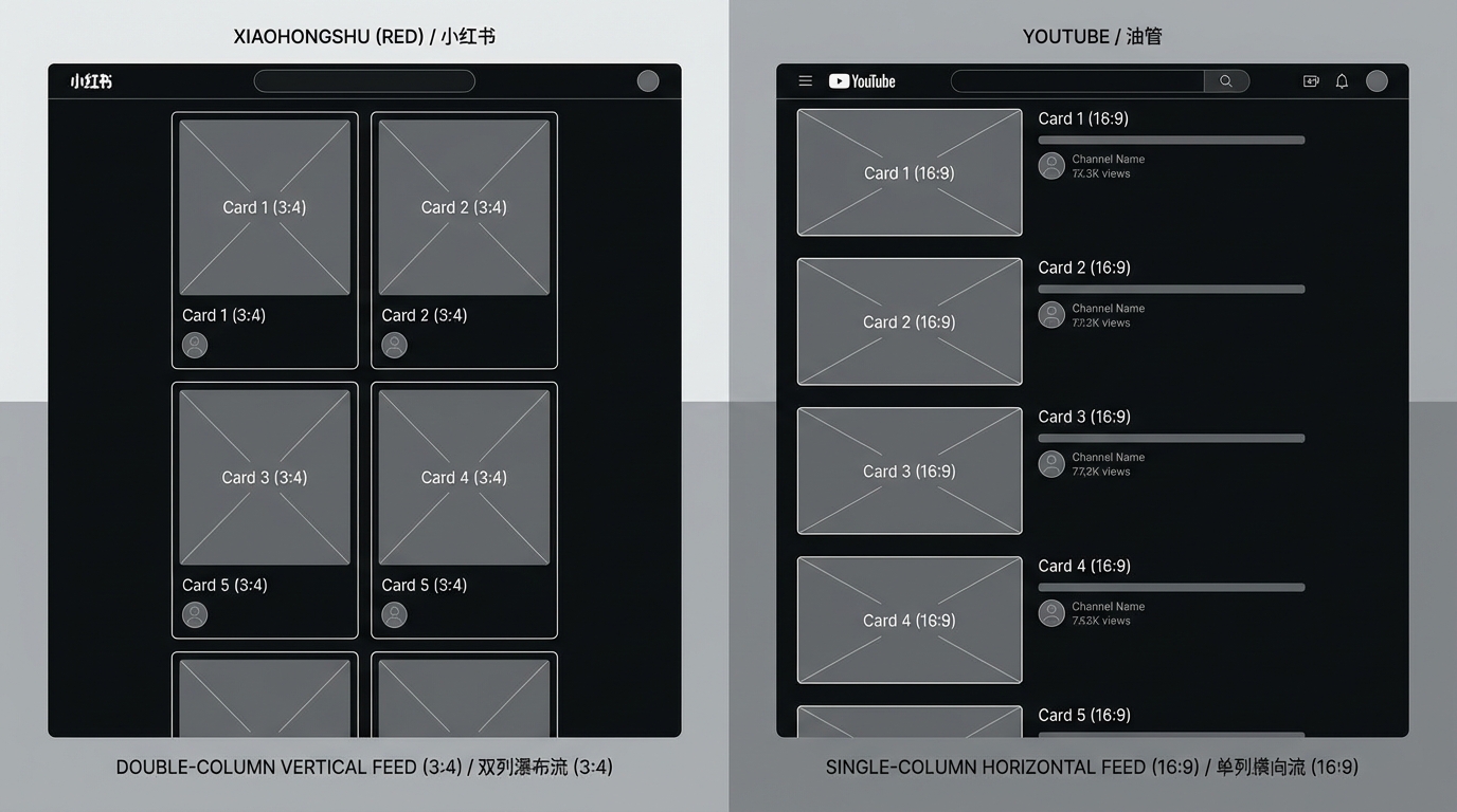
Xiaohongshu's double-column waterfall layout means your cover is competing side-by-side with the one next to it. The average scrolling speed of a user's thumb in the feed is 4-6 images per second, meaning your cover has only 150-250 milliseconds to catch their eye.
Xiaohongshu Covers vs. YouTube Thumbnails: Cognitive Differences
| Dimension | Xiaohongshu | YouTube |
|---|---|---|
| Aspect Ratio | 3:4 Vertical | 16:9 Horizontal |
| Browsing Method | Double-column waterfall | Single-column list/grid |
| Competitive Environment | 2-4 displayed simultaneously | 4-8 displayed simultaneously |
| Text Space | More vertical space | Limited space |
| User Mindset | "Window shopping" discovery mode | Goal-oriented search mode |
These differences mean that thumbnail strategies effective on YouTube may completely fail when copied to Xiaohongshu.
5 Cognitive Characteristics of High-Traffic Xiaohongshu Covers
1. The Primary Visual Focus is in the Top 1/3
Eye-tracking data shows that Xiaohongshu users' first point of fixation is concentrated in the top 1/3 area of the cover. This is because in the waterfall flow, the lower half of the cover is often obscured by the title text or squeezed by the next row of content. Key information must be placed in the upper section.
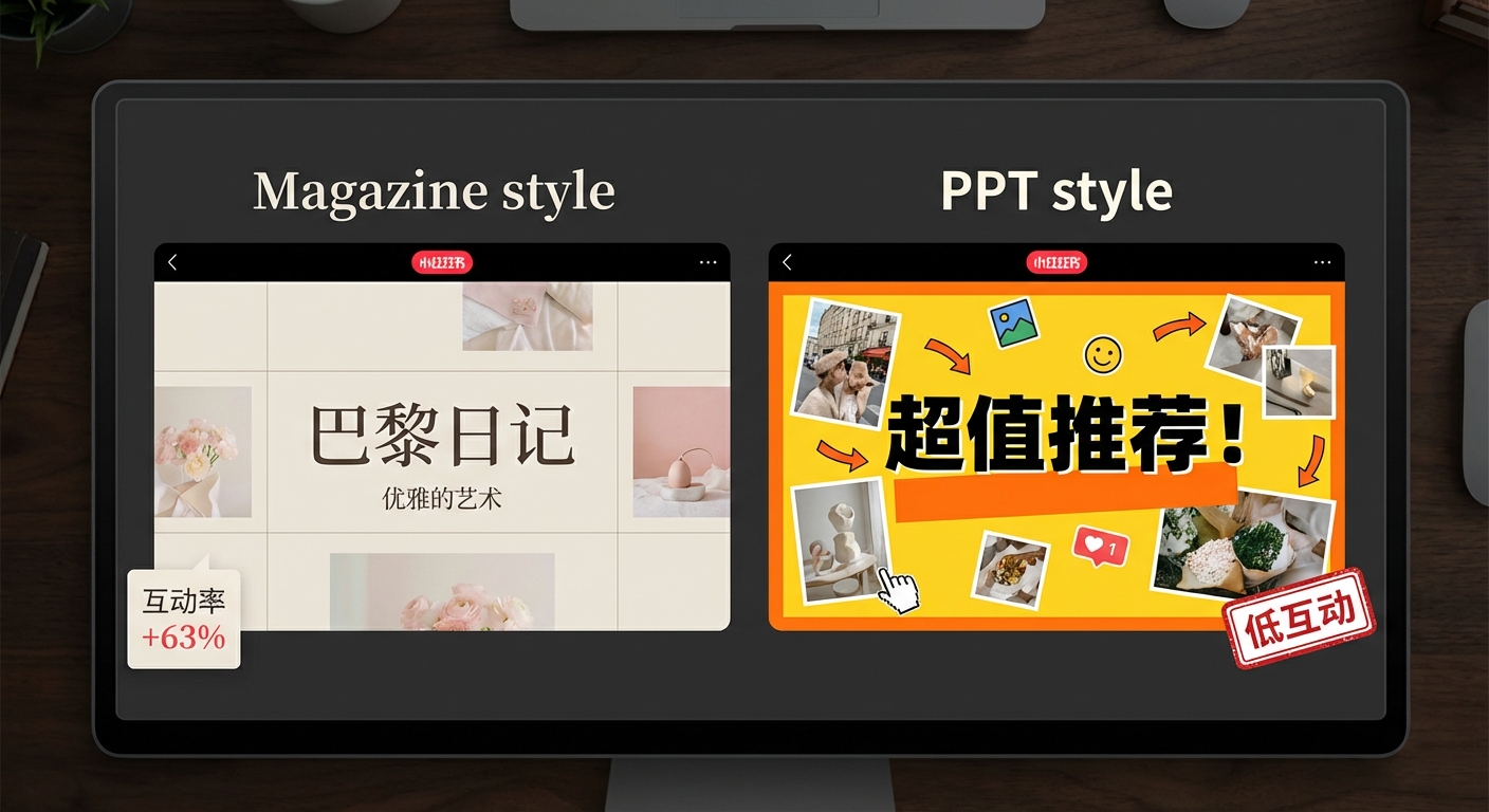
2. "Magazine-Style" Layouts Outperform "PPT-Style"
Xiaohongshu's user base has high aesthetic standards. A "magazine-style" layout using serif fonts + white space + alignment lines has an engagement rate 63% higher than crude, large-font "PPT-style" covers.
3. Color Saturation Should Be Higher Than the Platform's Base Tone
Xiaohongshu's interface is primarily white, and the feed is filled with a large amount of soft-toned content. Using colors with slightly higher saturation that aren't jarring can make the cover "pop" visually. We recommend an HSL saturation between 65-85%.
4. Numbers and Symbols are More Eye-Catching Than Text
Dehaene points out in The Number Sense (Oxford University Press, 2011) that the brain has specialized pathways for processing numbers, processing Arabic numerals 3-5 times faster than text. Nielsen Norman Group's web readability research (2007) also confirms this: numbers are prioritized during scanning. "7 Tips" attracts more attention than "Many Tips," and "↑ 300%" has more impact than "Significant Increase."
5. Real Scenes > Retouched Images > Solid Backgrounds
Xiaohongshu traffic trends for 2026 show that authentic, "breathable" scene photos are surpassing over-retouched images. Users are becoming increasingly sensitive to "fake" content, and the brain's "authenticity detection" (involving the prefrontal cortex) filters out content that looks too "perfect" at an unconscious level.
FlowDx Xiaohongshu Diagnosis Case Study
A beauty blogger's note cover was diagnosed by FlowDx, revealing two key issues:
- Product Blending into Background — The attention heatmap showed users' eyes were entirely focused on the model's face, while the product (lipstick) received nearly 0% attention.
- Title Text Too Small — In the mobile double-column display, 14px text was completely illegible.
After modification: The product was enlarged and highlighted with a contrasting color circle, and the title text was increased to 24px with a shadow. Following the changes, the note's "Little Eyes" (impressions) increased by 280%.
Practical Workflow for Xiaohongshu Cover Design
Based on our analysis of high-engagement notes, we recommend the following design process:
Step 1: Determine Content Type and Corresponding Template
High-traffic content types on Xiaohongshu each have different best practices for covers:
| Content Type | Cover Style | Key Elements |
|---|---|---|
| Tutorials/Guides | Step numbers + Key results | Prominent numbers, visualized results |
| Product Recommendations | Product matrix + Ratings | Clear products, explicit comparisons |
| Outfits/Makeup | Real-person display + Style tags | Overall aesthetic, authentic scenes |
| Pitfalls/Reviews | Before/After + Surprised expression | Strong contrast and disparity |
| Daily Sharing | Life scenes + Artistic layout | Authenticity, "breathability" |
Step 2: Design Cover and Pre-check with FlowDx
After completing the initial design in Canva, Xingtu, or PS, upload it to FlowDx for attention testing. Focus on:
- Whether the attention heatmap is concentrated on the core message you want to convey.
- Whether key text is legible at the actual size of the mobile double-column feed.
- Whether the "Visual Focus" score in the five-dimensional rating is above 60.
Step 3: Observe Data 2 Hours After Posting
Xiaohongshu's traffic distribution follows a "horse racing mechanism" — the engagement rate within the first 2 hours of posting determines whether it enters a larger traffic pool. If the cover CTR is low (slow growth in "Little Eyes"), consider modifying the cover within this window to reactivate it.
2026 Xiaohongshu Cover Trends
Based on the platform trends we've observed:
- "De-retouching" Trend — Click-through rates for over-Photoshopped covers continue to decline; authentic, textured content is more popular.
- Video Note Covers Become More Important — Video note covers no longer automatically capture the first frame; creators can upload a separate cover image.
- Increased Share of Search Traffic — Xiaohongshu is strengthening its search functionality, and text keywords in covers have a direct impact on search rankings.
- Vertical 3:4 Remains the Best Ratio — It occupies the largest visual area in the waterfall flow.
Frequently Asked Questions (FAQ)
What is the best size for a Xiaohongshu cover?
We recommend 1080×1440 pixels (3:4 vertical ratio). This ratio provides the largest display area in the double-column waterfall flow. A 1:1 square loses space at the top and bottom, and a 16:9 horizontal image will be significantly shrunk in the Xiaohongshu feed. We recommend PNG format (to maintain text clarity) or high-quality JPG.
How much text should be on the cover?
Xiaohongshu covers can have slightly more text than YouTube thumbnails (because the 3:4 vertical screen provides more vertical space), but we still suggest no more than 15 words for the core information. Title text should be 20px or larger (relative to 1080 width) to ensure it remains legible in the mobile double-column display. Subtitles can be smaller but must have a clear hierarchical difference from the main title.
How do I add keywords without affecting the aesthetic?
Keywords don't have to be forced into the cover image. You can use tag formats (small rounded rectangles + keywords) placed in the corners of the cover, which maintains the design aesthetic while helping with search indexing. Xiaohongshu's OCR system can recognize text on covers for search ranking.
Do I need to re-post after changing the cover?
No. Xiaohongshu allows you to replace the cover image directly via "Edit Note," and replacing it will not affect existing likes and comments. If a note's data is underperforming within 2 hours of posting, modifying the cover is the most effective "first aid" measure.
Diagnose Your Xiaohongshu Cover Now
Upload your cover to FlowDx and select the "Xiaohongshu" platform. The AI will provide specific optimization suggestions tailored for the Xiaohongshu double-column feed environment.
References
- Dehaene, S. (2011). The Number Sense: How the Mind Creates Mathematics. Oxford University Press.
- Nielsen Norman Group. (2007). Eyetracking Web Usability. New Riders.
- Xiaohongshu Creator Academy. (2025). Note Cover Design Guide.