In YouTube's recommendation algorithm, the thumbnail click-through rate (CTR) is one of the core metrics determining whether a video gets pushed to more viewers. Official YouTube data shows that the top 5% of videos on the platform have an average thumbnail CTR of 8-12%, while the platform average is only 2-4%.
This means a great thumbnail can give your content 3-5 times more exposure.
7 Data-Driven Characteristics of High-CTR Thumbnails
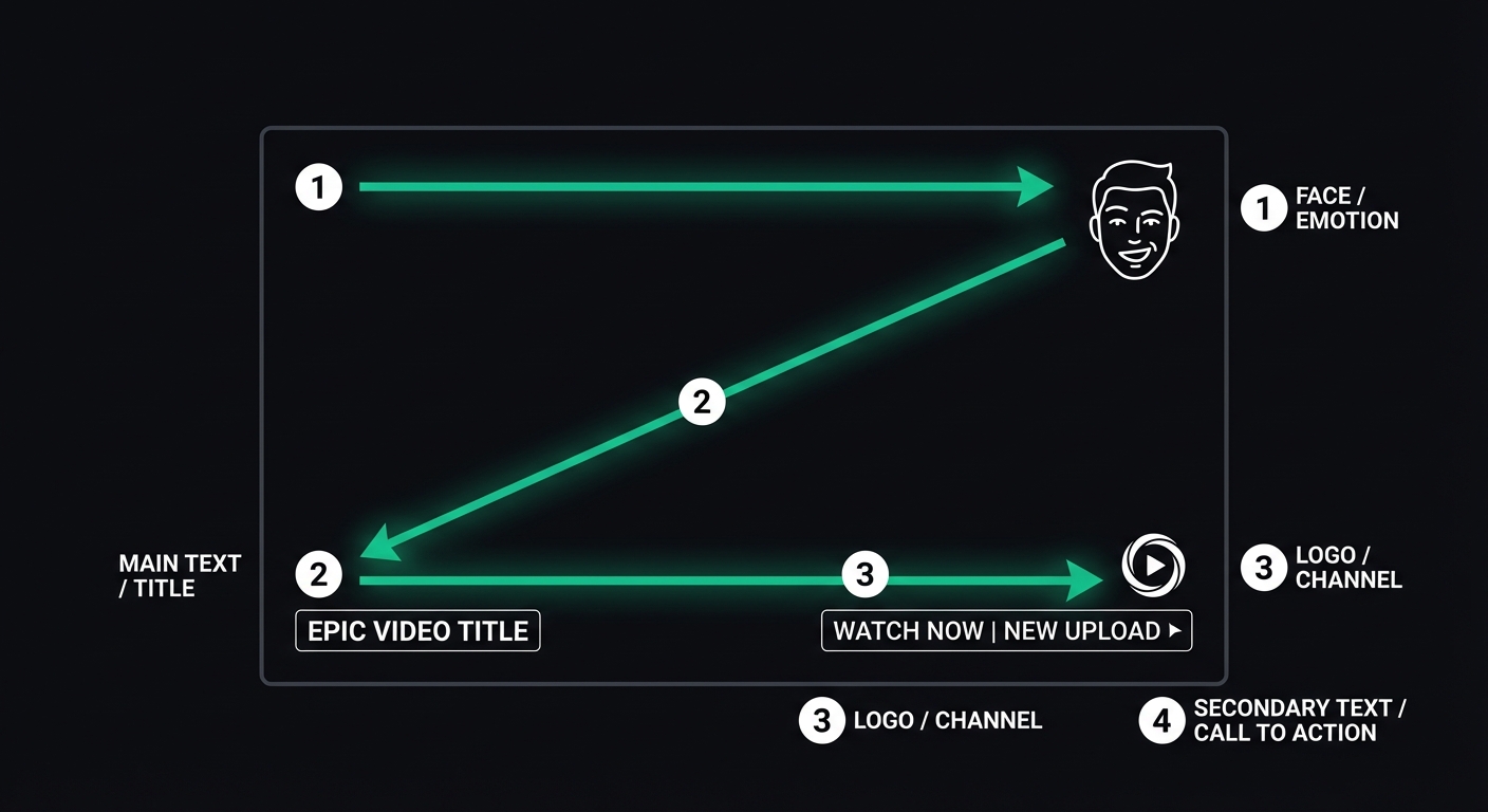
1. Faces Occupying 30%+ with Exaggerated Expressions
Nancy Kanwisher discovered the "fusiform face area" (FFA) in the brain's fusiform gyrus in the Journal of Neuroscience (1997), which responds in under 170ms. Research by Calvo & Nummenmaa published in Cognition & Emotion (2016) found that faces with exaggerated expressions receive significantly more fixations than neutral faces. Our data shows that CTR increases most significantly when the face area occupies more than 30% of the thumbnail. But the key is the expression—calm expressions provide almost no boost, while high-energy expressions like surprise, excitement, or confusion result in a 52% higher CTR.
2. No More Than 6 Words
Thumbnails are displayed at a very small size in the feed (approximately 168×94 pixels on mobile). Text exceeding 6 words is nearly unreadable at this scale. Best practice: 3-4 large words that convey one core message.
3. Complementary Color Schemes
The YouTube interface is primarily white or dark gray. Thumbnails using complementary colors (Red+Blue, Yellow+Purple, Orange+Cyan) stand out more in the feed. Avoid using grays and whites that are too similar to the YouTube UI as your primary colors.
4. Rule of Thirds + Clear Visual Hierarchy
Eye-tracking research by Nielsen Norman Group (2006, updated 2020) confirms the existence of F-shaped and Z-shaped scanning patterns. When users browse thumbnails, their eyes start from the top-left corner and scan in a Z-shape. Place your most important elements (faces or key text) on the golden ratio intersections.
5. The Curiosity Gap
The "Information Gap Theory" proposed by George Loewenstein in Psychological Bulletin (1994) explains why "This result was so unexpected" triggers more curiosity than "10 SEO Tips." A thumbnail should hint at the content without fully revealing it, forcing the user to click to get the answer.
6. Complementary to the Title, Not Repetitive
The thumbnail and title should each convey different information. If the title is "I Lost 20 Pounds in 30 Days," the thumbnail should show a visual contrast (Before/After) rather than repeating the text "Lost 20 Pounds in 30 Days."
7. Consistent Brand Visual Style
In the long run, you want fans to recognize your thumbnails instantly in their feed. Use consistent fonts, color schemes, and composition styles. However, do not sacrifice the clickability of an individual image for the sake of consistency.
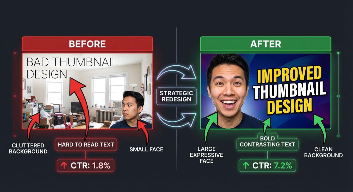
Case Study: FlowDx Diagnosing a Low-CTR Thumbnail
Below is a real diagnostic case. The original thumbnail had a CTR of only 1.8%. After a FlowDx diagnosis, the creator modified it based on the suggestions, and the CTR rose to 7.2%.
Issues Identified by FlowDx
- Text Overlapping Background — White text on a light background resulted in a contrast ratio of only 2.1:1 (WCAG requires 4.5:1).
- Face Too Small — The face occupied only 12% of the frame, leading to insufficient fusiform gyrus activation.
- Broken Visual Path — The attention heatmap showed user gaze scattered across 4 areas with no clear starting or ending point.
Modification Suggestions
- Enlarge the face to at least 30% of the frame and use an exaggerated expression.
- Add a dark stroke to the text or place it on a semi-transparent dark background bar.
- Reduce background elements to make the subject stand out more.
Optimize Your Thumbnails with FlowDx
Advanced Tips: Thumbnail Strategies for Different Channel Stages
Thumbnail strategies are not one-size-fits-all. Your channel's current stage determines your priorities:
Starting Phase (0-1,000 Subscribers): CTR Priority
At this stage, you have no brand recognition. The thumbnail's sole task is to get strangers to click. Feel free to use exaggerated expressions, high-contrast colors, and curiosity-driven hooks. Don't worry about "brand consistency"—you don't have a brand yet.
Growth Phase (1,000-100,000 Subscribers): Building Recognition
Start standardizing a visual template: consistent fonts, color schemes, and composition styles. Let returning viewers recognize you instantly in the feed. However, every thumbnail must still have a unique "hook"—don't sacrifice individual appeal for consistency.
Mature Phase (100,000+ Subscribers): Testing and Iteration
The YouTube Studio A/B testing feature (Test & Compare) allows you to test up to 3 versions of a thumbnail simultaneously. Use this feature to systematically verify what works. Data shows that top YouTubers test an average of 2-3 thumbnail versions per video.
YouTube Thumbnail Checklist
Run your thumbnail through this checklist before publishing:
- When scaled down to mobile feed size (168×94px), is the text still legible?
- Does the face occupy more than 30%? Is the expression high-energy?
- Is the text kept under 6 words?
- Does it stand out enough when placed next to other videos?
- Do the thumbnail and title convey different pieces of information?
- Does it create an information gap that compels a click?
- Do the colors contrast with the YouTube interface?
Frequently Asked Questions (FAQ)
What is the best size for a YouTube thumbnail?
YouTube officially recommends 1280×720 pixels (16:9 ratio), with a minimum width of 640 pixels. File size should not exceed 2MB, and formats supported include JPG, GIF, and PNG. However, in the actual feed, thumbnails are displayed as small as 168×94 to 360×202 pixels, so all visual elements must remain clear when scaled down.
Can I change the thumbnail after publishing? Does it affect recommendations?
Yes, YouTube allows you to change thumbnails at any time. YouTube has officially confirmed that changing a thumbnail does not reset the recommendation algorithm. In fact, many top creators swap thumbnails 24-48 hours after publishing based on initial CTR data. If the initial CTR is lower than the channel average, switching to a more attractive version can often "save" a video.
Is using AI to generate thumbnails effective?
AI-generated thumbnails are excellent in terms of visual quality, but they have two issues: first, they may lack the emotional connection of a real human face (the fusiform gyrus responds more strongly to real faces), and second, they can look "too perfect," lacking authenticity. A recommended approach is to use a real photo as the subject and use AI to assist with background design and layout, then verify the final result with FlowDx.
What if a small channel doesn't have a high-quality camera?
Thumbnails don't necessarily require high-end equipment. A smartphone camera is sufficient in well-lit environments. The keys are: plenty of natural light (near a window), a clean background, and exaggerated expressions. Use Canva or Photoshop for text and color grading. Thumbnail CTR correlates much more with composition and emotional expression than with image resolution.
Optimize Your Thumbnails with FlowDx
Upload your YouTube thumbnails to FlowDx to get attention heatmaps, five-dimensional cognitive scores, and specific modification suggestions. Every frame should be backed by science.
References
- Kanwisher, N. et al. (1997). The fusiform face area: A module in human extrastriate cortex specialized for face perception. Journal of Neuroscience, 17(11), 4302-4311.
- Calvo, M. G., & Nummenmaa, L. (2016). Perceptual and affective mechanisms in facial expression recognition. Cognition & Emotion, 30(6), 1081-1106.
- Nielsen Norman Group. (2020). How People Read on the Web: The Eyetracking Evidence. nngroup.com.
- Loewenstein, G. (1994). The psychology of curiosity: A review and reinterpretation. Psychological Bulletin, 116(1), 75-98.
- YouTube Creator Academy. (2024). Make Effective Thumbnails and Titles.